Trampled by Geese is a reminder to myself to look at the positive side of life and to endeavour to only write about things that inspire me rather than focus on what is negative in the world. Kirkegaard once wrote, “Being trampled by geese is a slow way of dying, but being eaten to death by envy and greed is even slower and more painful”.
We want to prevent chalky colours in our oil painting. Sure there are loads of ways to do this. I'm going to share a way that is one of the best methods I've stumbled on. And then I'll share my favourite, much easier way. Followed by an even easier way.
If you have a trick for preventing chalky colour mixing, please share. There are about thirty six thousand ways to do anything when it comes to oil painting. try some and see which one works best for you (then pop over here and let us know).
The right colour in the right place.
It's a mantra that seems to comfort painters. If we can perfect this art of putting the right colour in the right place, everything else will fall into place. It's a big fat lie, but it's a lovely lie that helps us feel better. (edges, values, and relationships are probably more important than colour, but that's another essay)
One of the easiest ways to learn about colour mixing, is to do colour matching. DrawMixPaint's style is especially focused on this idea of just (as if it's that simple) putting the right colour in the right place and poof! Painting happens perfectly. And even if that isn't the style you are going for in your own art, if you have ever struggled with milky or muddy colours, do a painting or two in his style and it will solve most if not all your colour problems.
Once you've tried his style, go back to your usual style and see how the colours suddenly behave kindly towards you instead of fighting against you at every stroke of the brush.
The mind-blowing crazy thing I found out from watching this guy mix colours is that, on a modern palette, there are two, not just one, but two different ways to lighten a colour. We can use Titanium white which is blue-leaning, or - and this is the mind-blowing bit - we can add YELLOW. (no hats were hurt in the blowing of this mind). Yellow can't get very dark in value and the yellow paint most of us use when oil painting today, is very, very light in value. Cad Yellow Lemon, Hansa, Azo... all of these are 7-8.5 on the value scale. Much lighter than we think they are.
I'm measuring these values Munsell style where 10 is the ultimate white - aka, the one that doesn't exist - and 0 is the ultimate black which again, is a colour that doesn't really exist. In comparison, Titanium white is probably about 9.5ish.
Next time you reach for white to lighten a colour. Stop. Ask yourself, does it need to be warmer or cooler? Would yellow do the trick?
And that's all well and good, but kind of hard. Isn't there an easier way?
Mixing Dark to Light
I admit it, I'm a mixer. I like to mix a few colours before embarking on a painting. That way I have a starting point that I can adjust as I go along.
When I'm mixing the colours, I start at the darkest colour I can see on my reference. I slowly get lighter, going as far as I can without adding white. I don't even put white on my palette yet.
Then I paint these areas in as smoothly as possible, because we are working with darks and darker midtones smooth texture helps them hide. When I get those more-or-less blocked in, then I'll put the white on my palette and start mixing the lighter colours. Titanium white is one of the more opaque colours and in oil painting, having opaque colours in the lights helps draw attention to the subject.
In watercolours, it used to be quite common to use opaque colours, especially white, to direct focus away from an area. See Turner and Constable's watercolours for some gorgeous examples of how white can make a watercolour painting sing!
This little trick of working without white for as long as I can manage helps keep the shadows pure and stops them from becoming chalky.
But there is an even easier way.
Change your white
Before, we talked about what we see as white being a very light blue. This causes milky chalky looking colours. What if we got rid of that problem altogether? What if we removed the box-standard Titanium white from our palette and replaced it with something kinder?
It's what people did for most of history.
Titanium white (PW6) is a very new pigment. It's very popular. Titanium white is a cheap pigment to produce. Benign to the human painter and most environmental issues as the lead used in the making is very very small and has tiny traces (but enough to get a warning label in California with the dead fish picture on it). It's a long lasting, happy little white. And it looks like a clean, pure white (aka, it's blue) and the opaque quality of this paint makes it even stronger in the mix..
These days we generally learn to paint with Titanium white and since we learned to paint with it, we keep going with it. It's a powerful colour paint and can lighten the value of a colour very quickly. And makes it more blue/cool at the same time.
But it's not the only white available.
Lead white (PW1 - toxic, yellow-leaning, semi-opaque) and Chalk white (PW18 - non-toxic, grey-blue-leaning, so transparent, it's often used as a filler or transparent mediums) are out of fashion these days. Zinc White (PW4 - non-toxic, blue-leaning, semi-transparent) too is out of fashion because it causes issues with the longevity of the painting. It's a fairly new pigment in the paint world too, and is proving unkind to the paintings.
That leaves us with variations of Titanium white. It doesn't have to be the overwhelmingly blue-leaning opaque hog of a pigment. It takes extra science to make that happen.
Different brands have different names, but some of the ones I've tried and been impressed with are Portrait White, Buff Titanium (unbleached titanium), transparent white, and flake white hue (the hue is important here as it means it's not the toxic lead stuff that we need to be extra careful when handling). And these whites make sense. They are all less blue than Titanium white and several are yellow or orange-leaning. Kind of like how our eyes see the world - slightly yellow or orange leaning...I might have to swap out my hat for a thinking cap.
Unless one is working from a poor quality photograph that has the highlights blown, bright blue-whites are unusual in our daily lives. It's often recommended that we first mix our Titanium white with a touch of yellow ochre before painting so we don't get tempted to use it out of the Titanium White tube.
Most of the world just isn't that white.
They give us this powerful paint and then tell us how to make it calmer. Why not skip that step and start with a warm white?
Or we could go a step further and take white off our palette entirely.
In this painting he doesn't use white at all. Just yellow.
My favourte for this kind of thing is Naples yellow as it's a very calm yellow and most modern versions have quite a bit of white added to it already (although the expensive ones might not).
So you want to get better at colour mixing and painting lovely things?
Welcome! (slightly evil laughter)
What if there was an exercise you only had to do once to completely revolutionize your approach to colour mixing? Get your shoes on, maybe a hat (people don't wear enough hats these days), and we're off on an adventure that will change you as a painter.
Before we head out, although what I write here is applicable to any medium where we mix or blend colours, I'm focusing on oil paint. For watercolourists and others that use the white of the paper and saturation as value control, there are some good stuff in here too, but probably only for people willing to break out of the modern restrictions to use "transparent pigments only". For the rest of you watercolourists, the TLDR is to pick the paper colour to match the painting.
For everyone else, let's solve that chalky and milky colour problem once and for all.
You ready?
Head to any DIY, hardware, or other shop that sells house paint, for like, painting walls.
No, seriously, once you are finished here. Do it.
Anyone can say anything on the internet - even me (evil grin) - give it a try for yourself.
So we head into the paint (for houses) shop and it stinks of chemicals, but never mind. There are swatches of fashionable colours on the wall to the left. The lighting is flickering florescent daylight bulbs. The shoes squeak on the floor, especially if we went to one of those high-end shops. Let's pretend we did. The paint professional is in the back, ignoring us through a cutout in the wall, with the effort of a cat who needs you to know you are being ignored. And we walk up to the paint swatches with White on our mind.
There's lots of cream. Blue cream. Peach cream. Tiny patches of this among the sea of colour. Although, not much white. Maybe these two at the bottom corner of this section? Are they white? Sort of grey when compared to all the other swatches.
A sigh of frustration is the key to get the paint expert to greet you. We must go through these rituals.
Small talk ends and we pop the question "Do you have any white paint?"
The pause hangs in the air like a physical thing we could reach out and pop with a pin. If we look carefully, we can see them spinning through the thoughts. Do these guys actually know what white paint is? How much explaining do they want or should I just choose one and say it's white? Where did they get those snazzy hats? I want to start wearing more hats... This lasts, oh, maybe half a second. Sometimes up to three seconds (and yes, I've done this a few times just for fun - you do know I'm evil, right?).
You might have to push them a bit (with words), but eventually we get to a place where they admit, "we don't actually have white paint. No one does. We have over 200 colours called white, but none of them are actually white white. They are all slightly one colour or another."
The last place I asked was super-posh and sold actually non-toxic milk paint for walls. They had over 600 whites and could order from a catalogue that had double that again. All flavours of white. None of them actually white white.
(Flavours of paint is metaphorical. Don't eat paint)
Well, there you go. You don't need to read any more. That tells you everything. White qua white does not exist in this world. (what's qua?)
I would love to blame the digital revolution for this next problem. But alas, computers may have made it worse, but it actually starts about two hundred years ago. White becomes Y-ified.
Actually, it's about the same time Y looses it's full vowel status. It becomes "sometimes Y". Same too with white. It looses colour status. It's no longer a colour, it is now a value-modifier. White suddenly means not just the paint colour, but the quality of whiteness perfected (qua means something like that. It's a pretentious way to say the most qualified quality that makes a thing a thing or something) . A whiteness that is so neutral, it cannot exist on earth - although sunlight comes close.
Real white is suddenly a value adjuster. It has no other function or personality in painting. It exists to make things lighter.
And this, my friends, is where art - and art education - goes horribly wrong.
Vocabulary time
Colour - Hue would be the most technical word for how I'm using this here. Although I am also mixing the word colour to also mean the name on the paint packaging. Aka, paint colour
Value - sometimes called tone. It's how much lightness or darkness something has. We can see this really well in a black and white photo. It's also an easy cheat for those who hate colour theory. Get the values right and you don't need to care about colour.
Saturation - This one is a bit tricky. It's the Much-ness of a colour. How intense or strong a specific colour is.
It's easier to see when compared to desaturated. Desaturated colour is a kind of a not-strong-at-all colour, like how the mud on my boots aren't really brown, but are a desaturated red-orange. Greys and browns and chalky pastels are all desaturated versions of other colours. Whereas firetrucks are usually highly saturated colours of red or yellow or... I don't know what other colours fire trucks are. Purple?
Where we used to lighten a colour, we whiten it. We add white because white is light. And light is white. Or so we are taught now.
Same with darkening a colour, we see this the same as blackening it.
And over time, this idea gets contorted. We are taught that colour is separate from value. We learn these rules and stop looking. This rule of adding white to lighten a colour stops us looking at what is actually happening.
I think that's a shame.
I feel strongly that people would have a much easier time learning colour theory and colour mixing if white (and black) could be a colour again.
If you have one of those phone gadgets (or a friend with one), the Pantone app is great for learning about colour. They make a huge science of it and every little shift in colour is categorized. Like colour theory taken to the most foolish extremes. Maybe don't use this when you are painting.
However, after poking about the house, looking at a few different objects and observing how the colour changes in different lighting, gather a pile of things that look the most white ever. A bit of paper. Maybe a flower. How about the ribbon on your new hat? See what the app has to say? It's very good at finding out if an object really is white.
And they won't be white. I bet you my new hat that every one of them is blue-leaning. They are a very pale (value), desaturated (saturation), blue (hue). That's because our eyes are weird.
No, not how we see stuff. The physical makeup of the two gooey little orbs in our head. The goo and other stuff that fills them isn't crystal clear. This changes the light as we see it. Eyes have biology. And as a result of biology, what looks white to us... the most white that could ever exist or not in the world. This is blue. Because science (aka, about 9 volumes of two inch thick books).
This is also why bleach (chemicals that make things white) makes cloth look yellow. It's making them closer to white. White looks yellow to us. To make the crisp linen shirt look white, we add bluing to the laundry. It's a bright blue dye to make clothes a very pale (value), desaturated (saturation), blue. Now it looks white.
We see very light, desaturated, blue as if it is white. Like A COLOUR! And it is a colour. In the world where we have paint on our palettes, white is a c o l o u r!
Remembering that dramatically changes how we use it in painting and mixing colours. Because white is a colour.
As pink is a kind of pale, desaturated red, white is usually a pale, desaturated blue (although it can also be a yellow... more on that much later).
In oil painting, we see Titanium White as the most white of them all.
It isn't really. But it is because our eyes see it is. And art is more about what our eyes see than what science badgers us with. (although science is useful for fixing problems like chalky paint mixing).
Okay, so how does all this stop me getting chalky and milky colours when I'm painting?
What is chalky oil painting? What is a chalky colour?
The problem is, chalky is a subjective work in art. But in general, we can assume when someone says a colour looks chalky or milky, they have gone too far in a general direction.
When I was a kid, the chalk board at the front of the school room was black and the chalk was white. When the chalk was erased, the board was no longer black, but sort of a milky, light grey colour. It was chalky.
Chalky means the colour is lighter (value) and bluer (hue) than the desired colour.
Another way to put it is: chalky colour is cooler and paler than the colour we want.
The opposite of chalky would be muddy colour, which is redder (warmer) and less saturated than the desired colour.
(another thing people can mean when they talk about chalky oil painting, especially the painting becoming chalky as it dries, is a problem called "sinking in" but that's for another day - tldr, it's made worse by using solvents)
Here's a video for those who want to geek out more about why thinking of white as a colour helps take your painting to a whole better level:
Basically, if the colour is too chalky, and you want to fix it, have a look and ask, does it need more yellow or more red? And if there is doubt, put it into three piles. Leave the first pile alone, the second gets red, the third gets yellow. See what happens. It's your paint. You are allowed to experiment with it.
That's a simple way to fix chalky colours. But I'm more interested in preventing them. Hang on to your hat, I've got some tricks for that.
Values aren't always easy. In this case, it's the light and darkness of the image that I'm trying to get right, or just a bit lighter than the final goal. Having a black and white printout that I can test on is a massive help for me.
You can see lots of places where I got it wrong. And the places where I got it right don't show up at all. Thankfully, I got more right than wrong. It's training my eyes and maybe one day I won't want this trick. But that's a long way off as I find it difficult to judge how the paint will look with the "hold the palette knife up to the source" trick.
I got most of the cup and saucer painted to my standards of "good enough". It's time to start the flowers.
I say "good enough" but between you and me, I am absolutely chuffed with how this is turning out. I had no idea I could paint this well. I had a vision, I put paint on canvas, somehow the two things are matching! Amazing.
For reasons I hope will become clear once colour happens, the flowers have a lot of texture. Thick paint that will take ages to dry. I can tell already, this won't be ready for colour before the 25th and this makes me sad.
But it will be worth it. I want this to be a painting to hang on my wall, so I'll take the extra effort and time to make it wall-worthy. I might even buy a frame for it!
I don't know if you can see in the photos, but in person, it looks almost like there is colour in there. An optical illusion or a trick of how warm mars black interacts with cool titanium white? The cup and saucer especially already look the correct colour. It's weird.
It's taken me 9 days to get this far on the first layer. One would imagine the early parts of the painting would be dry by now, but no such luck.
Tomorrow is the 25th of May, the anniversary of the Glorious Revolution in the book The Nights Watch and one for remembering those we lost. I won't have the colour finished in time, but perhaps I can finish this layer.
The mars black stiffens beyond use in only four hours. Which is good as it will dry quickly on the canvas, but sad because it's one of the most expensive tubes of paint I've ever touched. I've been trying to improve my clove box setup. It's getting there.
I bought this expecting it was wood, and it isn't. The goal is to rub linseed oil and clove essential oil into the wood to create a slick surface that smells of cloves. The small airspace combined with cloves would slow down the drying time of the un-painted oil paints. That's the theory. However, I can tell it's not wood because the places where I dropped essential oils and didn't rub it in for several seconds, are blistered. Essential oils like clove and rosemary oil are STRONG solvents. They dissolve all sorts of plastic and coatings easily.
But it's still working for now and now that I have all the mixing done, I'm just painting right form the clove box so I can close it up when interrupted.
Like when a flock of woodducks land on the balcony railing outside the window to watch me. They are so pretty!
Maybe a wood duck painting is in my future?
Another way to deal with distractions is to use a brush dip. This is a jar or metal container with a grid or spring in it to let the pigment fall down away from the bristles. I put safflower oil in it as it's slow drying and a few drops of either rosemary or clove essential oil. Since the mars black is drying so fast, I can simply put my brushes in the oil when I step away from the painting.
When it comes time to paint again, I wipe off as much of the oil as I can, then dip the brush in linseed oil (faster drying) and wipe that off. The extra step with linseed oil isn't needed, except I do want this layer to dry as fast as possible and safflower oil slows this down.
Thankfully I was able to get one of the printouts big enough at 12x12 inch so I could use it to trace the design onto my canvas instead of drawing it. A bit of graphite paper and some creative interpretations of the flowers later and I have this.
My original plan was to use Winton titanium white and 1980 mars black. Mix the two with a thick calcite putty. The 1980 brand mars black was very wet and had a lot of binder separation. Even before I put the putty in, it didn't feel very impressive. The putty was made with the Gamblin pigment PW18 which should be a transparent calcite powder, but made the paints even more milky. Two strokes on the canvas and I knew this wasn't going to work. So I painted all the lovely paint I just mixed onto a bit of canvas paper in a greyscale kind of thing. This is useful for testing glazing samples.
Instead, I went with what I know, the same white but Old Holland brand mars black... some extremely expensive paint I got for a steel on a "last chance" sale. This is no longer an easy paint to get here. Aka, hard to replace, expensive. I don't really want to use it. But I really want this painting to work.
My usual five piles. I try to get the middle to match middle grey and I got pretty close this time. I try not to use the black and the white when I'm painting an underpainting but for this one, there is a lot of area that needed black. Which is good because that pile - the one that didn't get mixed with white - the pile of black off to the far right, dried beyond use in about four hours!
Old Holland is an awesome paint, or so I'm told, because it has such an incredibly high pigment load. It's also why I'm annoyed with it. The old holland paints are designed to be used with a medium and I like painting right from the tube better. But a tiny touch of linseed oil and it's working (about five drops for the whole paint session).
And this is where I got to.
I was shocked by how difficult that terminator line was on the egg. That's the line where the egg suddenly turns from light to shadow side - like the dusk/dawn line on earth. And like the dawn/dusk line, I didn't quite get it right as it's... how to explain. If one is in the tropics or near the equator, dusk happens FAST. Sun is up, beautiful sunset for a few moments, then smack! sun is down. And I know this because in my foolish youth I went for a walk in the desert one afternoon. It's only a half hour taxi ride, and the other town is just over there, let's just save the money and walk, then spend it on a nice meal in a restaurant. And then the sunset came and boy was that beautiful, and look, stars, and all turned around looking at the different sky stuff. Um... which way were we walking again? There was zero light anywhere. No one waiting for us. And suddenly our shorts and tank tops seemed woefully inadequate. It felt like about 5 hours of confusion, but the watch said it was only about 12 minutes. Then suddenly, someone turned on the electricity and the town we were trying to get to was only a little to the right of where we expected it. We were shivering already and too cold to eat by the time we reached town.
Never again shall I go walking unguided in the desert at sunset.
anyway. eggs.
I'm from the Far North and sunsets here take Hours! Not a few minutes like near the equator. There, the sun practically falls from the sky. Here, well... it's 4pm in late spring. The shadows are getting long and it won't be long before the trees start to hide the sun a bit - maybe two or three hours from now. And dusk will start soon after - so four or five hours. Dark comes properly just after 9:30pm. Ish. It's still plenty light enough to see without a flashlight even without a moon.
It wasn't like that in the dessert. 12 minutes from "wow, look at that sunset" to "oh, shit, it is so dark, we are fucked!"
eggs.
The terminator line looks consistent on an egg, but I think that's not right. I got to paint more eggs to find out. I wonder if I find the further from the light source, the more time dusk takes.
And as I was painting the egg and trying to blend the shadows and light to smooth out that transition, the line kept moving. I had to put my picture back on it and retrace the line which was most of an inch away from me fussing with the paint. the egg was looking pretty wonky.
But I think I got it good enough for this layer.
Because the paint is drying so fast, I'm trying to work in sections instead of across the whole painting like I want to. I got to keep telling myself that I can fix things in the next layers. It's a hard thing to remember.
Now, if only I could find a few hours painting time without unscheduled humans I might be able to get in the swing of things.
The 25th of May is A very special day on the Discworld. It's a day for remembering those we lost.
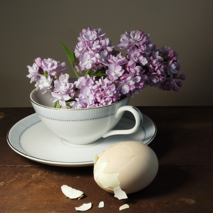
In the book The Nights Watch by Terry Pratchett, we see lilacs of remembering the Glorious Revolution. A hard boiled egg also factors into it. It's a great book and I thought it would be fun to paint something to remember it by.
This is the story of the painting process. I hope it turns out well.
Sadly, I don't have a copy of the book and the library has a ridiculously long wait list on any terry Pratchett book. So I did the next best thing to reading, I asked permies. There are some great ideas. But as I only have 10 days and am still struggling to learn to paint, I choose a simple motif.
Lilacs
Hard Boiled Egg
Tea
The Planning and reference
I am trying to get better at making thumbnail sketches, so I started there.
It's okay I guess. I kind of like the top center one and the more I look at these, the more I feel I want to go with a square format. I didn't draw any square ones, but the feeling was strong.
Next I figured out how to hard boil some eggs and did a photo shoot.
I played with composition a lot but also lighting. When it comes to photography and painting, lighting is the thing that gets me excited. I don't mind the subject so much, so long as the lighting is fun.
It's late afternoon and the window faces east, so it's diffused lighting to the right. It's not too bad. Very crisp, Victoriana look. No strong shadows. Pastels. But not really getting the feel of The Glorious Revolution.
I close the blinds and I get my standing lamp with daylight bulb (about 5k kelvin). This has the light focused on the flowers just above the handle and gives the egg a fun 3D effect.
This very very close to what I want.
I am especially glad I used a tripod and remote shutter button so I could shoot at 11 ISO stops, 100 iso, and get a deeper depth of field.
Almost no editing needed. Cranked the contrast up 0.2 points and exposure up 0.33 (which doesn't make sense because each program uses a different number - basically, it's the smallest amount I can move the slider in that program)
But something still isn't quite right yet.
Lights and shadows are in my mind. Then I remembered that the book is probably named after the painting. The Nights Watch by Rembrandt. Rembrandt lighting is famous as he loves having the dark in the back and a directional beam of light on the subject. So I think, what's the least amount of mucking about with this image I can do to get that effect? Vignette!
This is what I settled on and got my copy printed at the local print shop today so I can use it as a reference.
It was kind of annoying (in an okay way) as he pestered me with all sorts of questions about the software I used to generate the image. Was it photoshop or did I use AI to make it better? I don't think he believed me when I said I just do all the work before pressing the shutter.
I wonder if most people think that way now. Only 3 years since Chat GDP and we are already trained to think all dramatic images are AI. scary stuff.

")