
There is more than one kind of painting going on these days.
I like the other kind better
I like the other kind better


Nah.
Need to work on brush control more.
Sometimes the chicken works, and other times it's just not ready to be painted yet.

I don't know this hen. I've never seen her before. But she showed up on picture day. And was never seen again.

Oh well. I'll begin with a wash.
I wonder if I could paint goldy in Zorn?

That's pretty! I wish I could remember how I got the different shades of red. I want to try this again.

I don't know why, but tutorials are probably the worst way for me to learn. I feel like I'm copying a painting or even steps of a painting. I think I would do better if I could have the steps but work from life or a phot rather than follow someone else's painting.
Anyway, this never amounted to anything. It's also the wrong time of year to be thinking of cherry blossoms when I'm having to keep the frost off the humming bird feeders.

First time using caput mortuum (beautiful rich, granulating opaque watercolour, earth red) but I lost some of the glow so I used some gold paint to give him back some shine before the final layer.
I tried a thing, it kind of worked.

Well, it gets worse. This trio is secondary colours - what a crazy challenge I set myself to paint something with this.

Same lifting problems as last time. I tried to use it to my advantage, but I just couldn't get the deep darkness I wanted. Adding layers to make it darker, lifted the old layer and made it lighter. It's like opposite to what I would expect watercolours to do.
The reference I used for this is a photo I took a few years back in the local park. Dappled light through the leaves and a face that caves in on itself. Brilliant.
After Halloween, thousands of pumpkins, carved, melted, burnt, and rotting, appear in one of the local parks. It's a marvelous thing to see.
We like to pretend wildlife eats them all, but in reality the tax dollars clean them up. Money well spent. I wonder if the weather will let me go with my paint set instead of just a camera this year?
These should be so beautiful. I had such wonderful results buying handmade watercolour so far, that I thought I would try a different seller on etsy. They get great reviews.

They swatch beautifully!
Not sure this is quite cut out for a chicken. How about one of my other obsessions? A hobbit-ish house?

The first layer started off well. Blending is lovely. Got some good strong colour right away.
The problem comes with the next layer. See that window on the right. Smudge city.
The paint lifts like crazy. One layer painting is fine, but I like to layer. sigh. They feel like they aren't bonding to the paper like regular watercolours. Some watercolours lift a bit, but it usually needs more than a hint of water. These feel like they don't have enough binder. But maybe I just choose the wrong colours?
Again with the Beam Paints - more and more I fall in love with them. Lucky for me the price is about equal or less than most big name paints in the local art shops.

And my new favourite limited palette.
Timberwolf (paynes grey)
Mars (caput mortuum)
and Fall Popular (hansa yellow)
For this one, I included a bit of graphite, but meh. It's not the right addition to this trio.
(and yes, this is totally a variation on Handsome - glad you noticed. I use him to try out new colour combinations but mostly I give him back his comb points because poor fella)
web-ready.jpg)
I think this is one of my favouite examples of how much personality handmade paints can add to the picture. I don't think I could get the feathers half way close without it.
Painting feathers are hard (is hard?)

Painting light to dark and using the natural texture of the paint to help discover the chicken.
Still, he would look better with a tail.

You know the one, right?
(and yes, I'm fishing for comments to see if anyone is out there in the void)

These cute little guys are paint stones. Handmade watercolour by Beam Paints.
(pro tip, sign up for their mailing list now as they have epic black friday sales)
Lightfast pigments, gum arabic, and Manitoulin maple sap blend together to create a handmade saturated colour that is a joy to paint with. From thick stripes to fine washes and details, quality is evident in every stroke. Our watercolours are shaped into paintstones, our version of a half-pan, before being wrapped in beeswaxed cloth. Our pans are packaged in slices of cedar and birch offcuts from an Indigenous sustainable lumber operation.
I adore the ethos of this paint maker. Ecological sound practices, plastic free packaging, a focus on safety, and the romantic names of the different colours.
Featured here are Mars Black, Turtle Belly red, Harvest Wheat (yellow ochre) and Limestone white. It makes a nice variation on the zorn palette.
Although I am having issues adjusting to these paints as they have so much more pigment than I'm used to working with the student grade watercolours. The paints also have personality that they contribute to the painting - much more than the big commercial brands.
Also a big thanks to Dad for making me a stand for my paints out of the wood from a branch from our apple tree.

A couple more lofi girl studies from the video I posted last time.
This first one is in Gansai Tambi paints and playing with backruns in the background.

This one is in my new favourite limited colour palette. More on that soon.
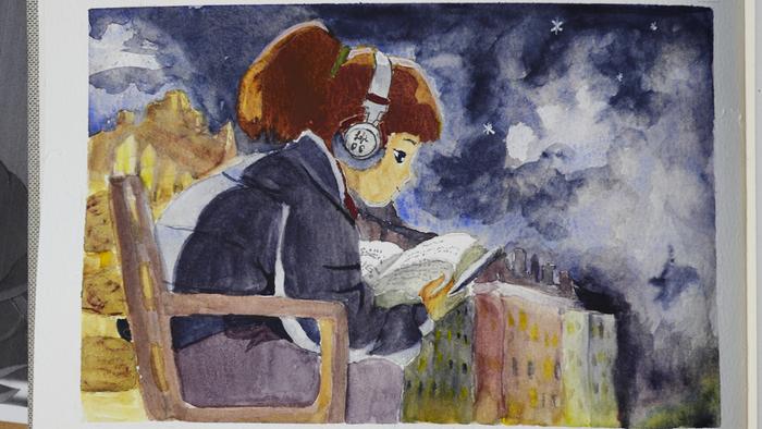

The colours worked, but the painting style is harder than I expected. I am not used to doing large areas of flat colour. It doesn't help that I'm still using that faulty paper, it shows up a lot in the skin and dark. But still, not bad.


The white is more opaque and powerful than regular watercolour white and I love how it interacts with the skin tone. So too is the black and when mixed with the red it makes some lovely browns.
Bonus points if you know what movie this is from. I wasn't brave enough to do his eyebrows big enough.


