
Painting light to dark and using the natural texture of the paint to help discover the chicken.
Still, he would look better with a tail.
Painting light to dark and using the natural texture of the paint to help discover the chicken.
Still, he would look better with a tail.

You know the one, right?
(and yes, I'm fishing for comments to see if anyone is out there in the void)

These cute little guys are paint stones. Handmade watercolour by Beam Paints.
(pro tip, sign up for their mailing list now as they have epic black friday sales)
Lightfast pigments, gum arabic, and Manitoulin maple sap blend together to create a handmade saturated colour that is a joy to paint with. From thick stripes to fine washes and details, quality is evident in every stroke. Our watercolours are shaped into paintstones, our version of a half-pan, before being wrapped in beeswaxed cloth. Our pans are packaged in slices of cedar and birch offcuts from an Indigenous sustainable lumber operation.
I adore the ethos of this paint maker. Ecological sound practices, plastic free packaging, a focus on safety, and the romantic names of the different colours.
Featured here are Mars Black, Turtle Belly red, Harvest Wheat (yellow ochre) and Limestone white. It makes a nice variation on the zorn palette.
Although I am having issues adjusting to these paints as they have so much more pigment than I'm used to working with the student grade watercolours. The paints also have personality that they contribute to the painting - much more than the big commercial brands.
Also a big thanks to Dad for making me a stand for my paints out of the wood from a branch from our apple tree.

A couple more lofi girl studies from the video I posted last time.
This first one is in Gansai Tambi paints and playing with backruns in the background.

This one is in my new favourite limited colour palette. More on that soon.
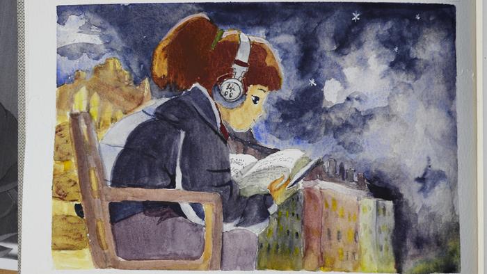

The colours worked, but the painting style is harder than I expected. I am not used to doing large areas of flat colour. It doesn't help that I'm still using that faulty paper, it shows up a lot in the skin and dark. But still, not bad.


The white is more opaque and powerful than regular watercolour white and I love how it interacts with the skin tone. So too is the black and when mixed with the red it makes some lovely browns.
Bonus points if you know what movie this is from. I wasn't brave enough to do his eyebrows big enough.

In many ways, I adore how this turned out. The granulation. The way the white pushes back his hat and cloak while the transparent watercolours in the staff make it almost glow.
What I didn't know, and is hard to see in this photo, is the paper had gone off. The sizing (the layer that protects the paper from the water) had decayed due to poor storage prior to the book shipping to me. You can see it most near the top of the staff where there's a white patch that didn't take the background colour and some places where it absorbed too much.
I ended up contacting the manufacturer and got a refund for the books (yes, I bought two). I'm still going to use these, but alas, not for the nice record keeping I was hoping for. This is going to be another practice journal.


In Ancient Greece, it was called the Apelles Palette, many Renaissance painters used a variation on it, only with the newly discovered vermillion. Anyway, there are about 36 hundred names for these four colours. But I can spell Zorn. So Zorn it is.
For this, I'm experimenting with white in watercolours and a couple of different blacks. Granulating mars black for the background and interesting how white can bring forward or push back certain subjects.
It's also around this time, I'm borrowing a lot of books from the library on the history of watercolour and discover that it's not until about 1960 that white became forbidden in watercolours.
I think teachers might have had trouble explaining/understanding that white and black aren't good at values - they don't lighten or darken colours well. In watercolour this is done with saturation (the amount of paint) more than anything. Since they couldn't explain/understand this, they forbid white (and black) in the classroom. And people took this to mean that all white and black are forbidden in watercolours.
I think that's a shame as these two can do amazing effects. Just look at some of the old masters from Turner, Constable, Van Gogh, Emily Car... none of them were afraid of white or "body colour" in their watercolours. Why are we?


And upgrading my paint box.

There are some colours I use a lot more like Burnt Sienna and Yellow Ochre, so they get more pans. I also left a special spot for Potters Pink as I would love to try that one day.
(these blog entries are coming in a bit out of order, but I hope to catch up to the current day in a few months)
-web-ready.jpg "and there's a chicken")
Painting that it's a doll is hard, so I just focused on the idea.
But also, something was missing, so I added some gold ink to his robe and stars


The second thing that must happen is a Wizzard! (comment if you know why it has two Z's)
Here our Wizzard is having a walk in the potato patch. He loves potatoes.
Only, it goes all wrong somehow.


Details on how Nicole made this mighty wizzard here.
this is me just showing off another needle felted chicken by fairy grove creations

And my other favourite thing - coffee!
(make note of how small that coffee plant is in the coffee bag, it comes back later)
To understand the next painting, two things must happen.
First, chickens!

This is needle felted henny penny! You can get your own epic chicken here.

It's amplifies what I love about watercolours - the paints participate in the creation. They flow and granulate adding texture and surprise.


